kfeDaddy2k
Junior Member
 
Posts: 13
Registered: 4-13-2003
Member Is Offline
|
|
posted on 11-21-2003 at 03:58 AM
|


|
|
A couple of requests for touchscreen users
I had a couple ideas I thought I 'd share, in hopes of them materializing in a near future version.
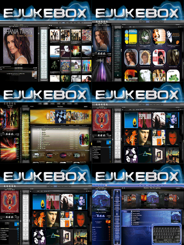
I'm using eJukebox on a mini-itx system with a 7" widescreen touchscreen in my Tahoe. Needless to say, with the 800x600 minimum resolution
for eJukebox, things are quite small on the screen. While I CAN read things fine, clicking buttons and so forth is a bit of an issue.
I'd like to see a larger ">>" button in the now playing window, allowing me to go to the next song easier. I'd also like to
see a larger "Next" area to click in the playlist area when only one song is up next. I like to click "next" a few times until I
get a better song from my popularity settings.
Again, these are probably only isses for people with small touchscreens, but it is a concern for me and a few others I've talked to.
Anyway, the software rocks and I love it more and more each day. Keep up the great work.
Kurt
|
|
|
Martin
Junior Member
 
Posts: 4
Registered: 6-22-2004
Location: Australia
Member Is Offline
|
|
posted on 6-29-2004 at 04:51 AM
|


|
|
Touch screens
I'm using a 17" touch screen at 1024x 768 and it is IMPOSSIBLE to use
The PLay now screen needs to be scalable
and the features in Kiosk need to be limited .. THATS WHY WE WANT KIOSK and not just full screen
The Aristist, Album.. etc at the top is alos to small
M
|
|
|
timmyotoole
Junior Member
 
Posts: 56
Registered: 4-11-2003
Member Is Offline
|
|
posted on 6-29-2004 at 10:14 AM
|


|
|
controls
i agree. i've always said the play and next buttons were too small. even at 800x600 it is difficult to use with a touchscreen.
it would be great if there was a way to make them bigger or if there was some type of plugin hat allowed larger controls to appear somewhere on the
songlist or the bottom of he playlist
If Nothing We Do Matters...
Then All That Matters Is What We Do
|
|
|


