junk
Member
  
Posts: 480
Registered: 5-10-2003
Location: Norway
Member Is Offline
|
|
posted on 5-24-2003 at 09:19 AM
|


|
|
The Album image as background function...
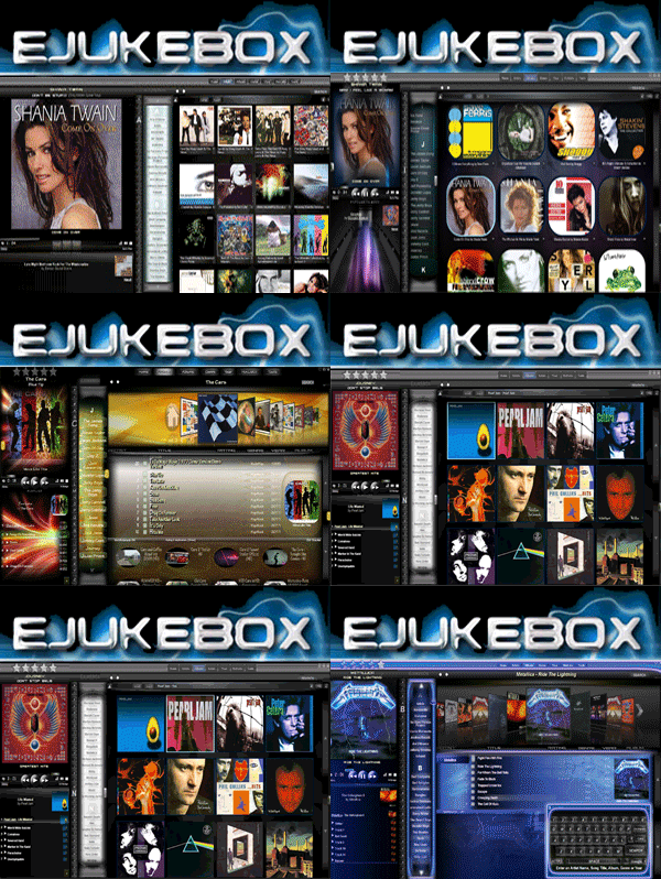
The function "Tile Album images as background in Songlist" has potential, but very few albums look good when tiled. And also, it reminds me
of the old days where you didn't have enough RAM to use a big image, so you had to tile.
What i'd like, is the image to be enlarged so you'd only see one cover. The album image should be proportionally resized to fit the song
listing, it doesn't matter if the edges becomes cropped a bit.
Especially used along with the transparent song listing, the result would be awesome!
|
|
|
junk
Member
  
Posts: 480
Registered: 5-10-2003
Location: Norway
Member Is Offline
|
|
posted on 5-24-2003 at 12:14 PM
|


|
|
I made a mock-up example in photoshop, to show you what i mean.
junk has attached this image:

|
|
|
junk
Member
  
Posts: 480
Registered: 5-10-2003
Location: Norway
Member Is Offline
|
|
posted on 5-24-2003 at 12:23 PM
|


|
|
Hehe. Another thing. While doing the previous image, i thought of an additional function...
If you could set the transparency of the background image yourself (it's at 31% in the example below), and change the colors in the songlist (the
.dis files) you could make your songlist look this way:
junk has attached this image:

|
|
|
junk
Member
  
Posts: 480
Registered: 5-10-2003
Location: Norway
Member Is Offline
|
|
posted on 7-30-2003 at 07:41 PM
|


|
|
It's been a while since i wrote this post, and i know more about the way eJukebox sorts out the album images now...
It would not make sense for eJukebox to save such a large image as a BMP on your HD, as it does with the other three image sizes.
One solution might be a realtime resizing when you enter the album... but it would slow things down a bit.
The other solution would be to save the large version of the image on the HD when updating the database, but as a highly compressed JPG. Guess that
would give quick loading, and would not take much more HD space than usual.
|
|
|
Fishy
Senior Member
   
Posts: 960
Registered: 10-19-2003
Location: Norway, Trondheim
Member Is Offline
|
|
posted on 4-24-2004 at 01:57 AM
|


|
|
I wholeheartly support this. I have been studying your mockup and yes it looks stunning. I can't get enought of that blending effect of the
songlist into the coverart in the background. Looks neat 
And ,as you pointed out, if those big images could be saved as highly compressed jpegs. It should not give much of a performance hit either! Resizing
in realtime is probably a bad idea, guess it would make the loading process of the songlist quite heavy.
Nice mockup and 5 stars for the idea. It would give the skin design an "interactive feeling" 
-----------
Fishy
|
|
|


