| Pages: 1 2 |
Audiosoft
|
|
posted on 8-27-2010 at 10:14 PM
|


|
|
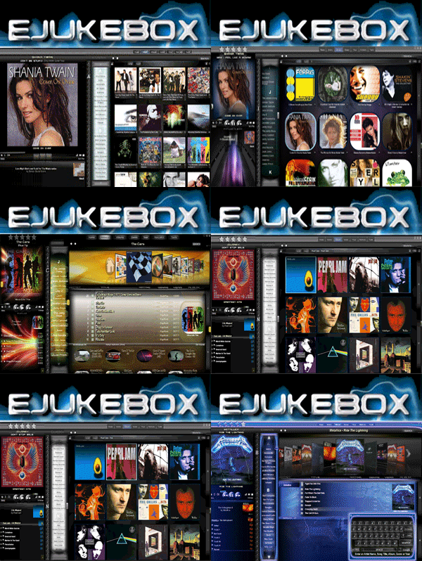
Yes thanks for noticing...it re-sizes the screenshots to the browser width and keeps the aspect ratio! Also updated so you can actually look at both
screens. One by using the mouse scroll wheel over the image and the other by using the scrollbar.
 Audiosoft |
|
|
Pirk
Posting Freak
    
Posts: 3976
Registered: 3-11-2003
Location: France
Member Is Offline
|
|
posted on 8-27-2010 at 10:27 PM
|


|
|
ah ok, i've tried all these subtleties.. now with the long text that was necessary. great work!
 Pirk |
|
|
Pirk
Posting Freak
    
Posts: 3976
Registered: 3-11-2003
Location: France
Member Is Offline
|
|
posted on 8-28-2010 at 10:47 PM
|


|
|
Audiosoft, I sent you a u2u.
 Pirk |
|
|
Audiosoft
|
|
posted on 8-29-2010 at 09:19 PM
|


|
|
maybe switch your MainButtonsHI.png <->MainButtons.png
...
add this to the playlist.dis body {}
filter:progid:DXImageTransform.Microsoft.gradient(enabled='true',startColorstr=#55FF0000,endColorstr=#000000,GradientType=0);
that also has a pretty neat effect on your artistlist.dis body
this songlist-table2.png makes the songlist easier to read without having to make the individual title genre and year less transparent
Audiosoft has attached this image:

 Audiosoft |
|
|
Pirk
Posting Freak
    
Posts: 3976
Registered: 3-11-2003
Location: France
Member Is Offline
|
|
posted on 8-29-2010 at 10:03 PM
|


|
|
You are right Audiosoft, in my Crimson skin sometimes there is a problem with bad transparency results in the songlist. I already tried to put some
black behind.. But then in many cases i lose good transparency effects, when the album images are contrasted. The only problem is with some album
colors (full red or full green..) or when the background image is not contrasted enough.
Maybe could you make or add something "magic" (a filter or anything else..) so that the contrast is always good? Keeping transparency! You know like
the Windows 7 transparent frames! Can't you find the "method" used by Microsoft?
 Pirk |
|
|
Audiosoft
|
|
posted on 8-29-2010 at 10:15 PM
|


|
|
win7 suffers the same problem sometimes even with that nice blur effect. i'm afraid i can't do any magic on that. just need to make it look a little
more unified and easy to read and people will love crimson allot more
Audiosoft has attached this image:

 Audiosoft |
|
|
Pirk
Posting Freak
    
Posts: 3976
Registered: 3-11-2003
Location: France
Member Is Offline
|
|
posted on 8-29-2010 at 11:19 PM
|


|
|
well why not Audiosoft! but i don't want to lose the essence of my skin: Transparency Effects: 
i could just make a songlist version with black behind, and another without!
however I like the shelf3d in Red!
Pirk has attached this image:

 Pirk |
|
|
| Pages: 1 2 |


