Audiosoft
|
|
posted on 1-8-2007 at 12:36 AM
|


|
|
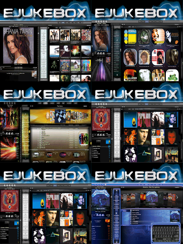
BlueJ Skin
It is still a 'work in progress' but if anyone wants to download this skin it is in the 3rd post below.
eJukebox v4.3 setup and upgrade will install the finished version of this skin.
I am trying to decide if first time eJukebox users will startup with this skin or the classic default skin. Let me know what you think.
Audiosoft has attached this image:

 Audiosoft |
|
|
rllercstr7
Member
  
Posts: 377
Registered: 8-2-2004
Location: US
Member Is Offline
|
|
posted on 1-8-2007 at 04:13 AM
|


|
|
Wow Audiosoft That looks great. I would be happy to test it out and report anything I find.
A couple things I see looking at your screenshot could be changed. The area around the search button looks a little funny because the area inside the
C in the word search etc... is totally black and doesn't match the background of the area around it.
One thing I think would look really neat and go well with the skin is to make the word eJukebox and the teal bar above the Now Playing area a silver
chrome type color. For some reason the teal bar and cream outlined eJuebox logo don't seem to flow the best, but thats just my opinion. You could go
with the same box style outlines for the category headers (Home, Artists, Albums...) as the current skin and make them a similar silver color to
match, or use the style you used previously on the Album list sorting options (See pic below). I think the little chrome-like outline around the words
Albums, Refresh etc... looks really sharp and gives a 3D effect.
That was a nice suprise Audiosoft I can tell you spent a long time tinkering to get it where it is now. Great job 
rllercstr7 has attached this image:

|
|
|
Audiosoft
|
|
posted on 1-8-2007 at 05:03 AM
|


|
|
thanks rllercstr7, i am not sure about that blue neon bar at the top left. It looks pretty good just all black but i wanted the now playing section to
seem active. the color changes to red when paused etc. chrome might look better. i am going to try a couple more modifications out. Here is the
current skin.zip. I named it the 'BlueJ' skin for now. Feel free to make some improvements and to post alternate versions of this skin.
To install this skin...do not extract the zip. Save the attached BlueJ.zip file to C:\Program Files\eJukebox\Skins\. Access 'BlueJ' on the Skin
section of the Tools button menu.
Note: Skin download was updated at 7PM Jan 9th, 2006. Original skin had 10 downloads. Replacing this BlueJ.zip over the old one will install the
updated version
Attachment: BlueJ.zip (878.42kb)
This file has been downloaded 2012 times
 Audiosoft |
|
|
rllercstr7
Member
  
Posts: 377
Registered: 8-2-2004
Location: US
Member Is Offline
|
|
posted on 1-8-2007 at 06:45 AM
|


|
|
|
Thanks Audiosoft. I'll have a look tomorrow, but I don't know how much time I will have to modify as college classes are starting for me. Its really
neat that you do this sort of thing so the users can give suggestions!
|
|
|
Pirk
Posting Freak
    
Posts: 3976
Registered: 3-11-2003
Location: France
Member Is Offline
|
|
posted on 1-8-2007 at 06:00 PM
|


|
|
Thank you Audiosoft for your work on a new skin, I know that is not a small thing!! I like your new songlist header.
I'm also working on a new header for my own skin.. rllercstr7, mine is chrome!  Well currently.. Well currently..
 Pirk |
|
|
rllercstr7
Member
  
Posts: 377
Registered: 8-2-2004
Location: US
Member Is Offline
|
|
posted on 1-8-2007 at 07:24 PM
|


|
|
One other thing I notice in this skin is that some of the bars that kind of broke sections up and defined them are now gone. In the picture below you
see the default and new skin. At the bottom of the old songlist there was a semi-transparent blue bar to help blend the album art in the background
with the songlist. On the new skin there is an abrupt cut off line with no blend to help things flow. The playlist window has a similar situation, but
it doesn't seem like it necesarilly needs any kind of bar.
Also if the albumart in not shown in the songlist and you hover over the album name it turns the box completely black preventing you from reading the
name.
When the pause button is pressed a one pixel bright blue line develops in the playlist area right through the words Custom Mode as is shown in the
screenshot. This disapears when you restart playback and skip ahead to the song that is up next.
rllercstr7 has attached this image:

|
|
|
Audiosoft
|
|
posted on 1-10-2007 at 12:02 AM
|


|
|
I have updated the skin download in the 3rd post. The update fixes the blue line in the playlist problem. More updates will come soon. Feel free to
post images or skin files of modifications you would like to see.
 Audiosoft |
|
|


