Songlist EXTENDED DATA VIEW in the works!
Audiosoft - 9-13-2003 at 08:55 AM
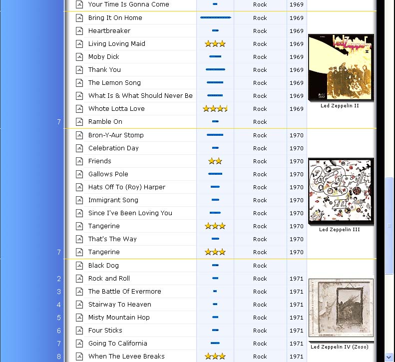
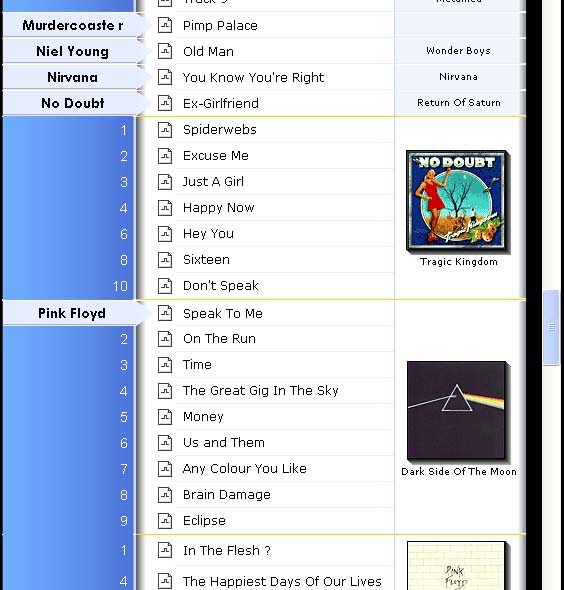
Here are screenshots of a new feature we have been working on: Songlist Extended Data View. I thought i would let you guys get a sneek peek. 
Songlist EDV will resize eJukebox to a width of 1024 pixels and the songlist will display the rating, genre, year, and LARGE album cover image for
each song. These screenshots also shows the songlist skin we are considering using for the default skin for new users in extended and normal data
view.
Also, Functionally new to the songlist in this screenshot; are the new yellow album seperators, which are always displayed before and after each album
containing 2 or more songs - in order to make the songlist easier to read.
Please feel free to post your comments on the new Songlist Extended Data View and the new default skin. 


bosh - 9-13-2003 at 01:26 PM
Hooray for EDV!
Is there any plans to allow star ratings in this mode? I feel glued to my PC when I can only rate the songs as they play.
Also, are more areas of the program going to acknowledge the new width? The album view and home page seem like likely candidates.
junk - 9-13-2003 at 02:08 PM
This seems great!  Really like these improvements. The yellow lines are
great, and seem very helpful. I like the other graphical touches as well; the gradients, and the new scrollbar. And the 1024 resizing... what can i
say, it is probably one of the most sought after improvements of eJukebox, if it also applies to the rest of the modes in eJukebox.
I am especially wondering how this can affect album view mode. Would be great to have both four albums in one row, and an artist list that
doesn't block the first column of albums. There's space for both, as far as i can see... 
this is great stuff indeed! 
Pirk - 9-13-2003 at 02:15 PM
Then here, I am rooted to the spot!
It's very nice... as usual!
Like junk says, that bodes well for the albumlist too!
Bravo! 
Pirk - 9-13-2003 at 06:31 PM
Now that I'm got over your screenshots  , I can tell you that I like a
lot the new informations displayed.
Everything is there in the large view: Genres, years, ratings and I think the blue lines represent the popularity count of unrated songs. That's
very good, and above all that will be very useful! I haved dreamed of that... and you have made it!
I see you have even made possible to put an album separator also in the songs column: nice work!
I also adore the blue shading, great skin! 
Now it got off on the right foot, I encourage you to also improve the albumlist. 
I am impatient for enjoy all that!
Congratulations! 
perf - 9-13-2003 at 06:54 PM
This looks great. I hope you keep the needs of us HTPC users in mind
- support of 800x600
- ability to use (very) large fonts
- keyboard support (for remotes that map to keypresses and for Girder)
/Per
Pirk - 9-13-2003 at 07:02 PM
| Quote: |
Message original : perf
I hope you keep the needs of us HTPC users in mind
- support of 800x600
- ability to use (very) large fonts
- keyboard support (for remotes that map to keypresses and for Girder)
/Per |
I hope too!
- In the large view? Unfortunately... I fear not, unless you have a 16/9 screen!
- I think there will be no problem.
- Right.
jhlurie - 9-13-2003 at 07:25 PM
In the words of Monty Burns...
egg-cellent...
Also: as much as I sympathize with the people without 1024x768 or better video support, I'd hate it if you had to compromise to down-size it for
800x600. It seems that you can't make a truly auto-resizable interface with your current toolset, but assuming two base-lines of 640x480 and
1024x768 seems like a good compromise. I imagine to make something fit 800x600 and yet have the additional columns, you'd really have to jigger
a lot of interface pieces...
Thirdly: I second Bosh's idea. As long as it doesn't slow things to a crawl... by all means let us rate in this mode. Then again, as a
long term strategy, the Genre could also eventually be a pull down scroll-box on this screen, and the song-name and year boxes double-clickable to
turn them into little edit boxes. Of course, don't delay ANYTHING to add these tweaks. I'd take it just as it looks in your cap right now!
 Just consider putting the idea of enhancing it in this way into your
long-term "do it someday if possible" list.
If you CAN'T make the stars "usable" in this mode, you might consider displaying the numerical score instead. Why? Well, in general
the numbers ARE ultimately more useful in my opinion--the reason they WEREN'T on the "Now Playing" panel would seem to be that the
Stars were easier to use for "marking" a score. So if marking a score isn't a concern... Although to be fair, aesthetically, the stars
DO look nicer, and maybe on a songlist may make it easier to visually compare songs (okay, after thinking of that last argument I'm going to
have to ask for opinions from others--in a view like this which is more useful, Stars or the Numerical score? I see advantages both ways now...)
Pirk - 9-14-2003 at 12:31 PM
Audiosoft,
Of course I hope you have also planned to add sorting abilities doing a click on each column title:
- Artist > Songtitle (already done),
- Artist > Rating/Popularity: switch, at each click on the column title, between:
/ratings (popularity lines hidden) --> Useful to bring out the "Star songs" of each ARTIST.
/popularity (stars hidden) --> Useful to see the "Pop songs" of each ARTIST.
/show both.
- Artist > Album > Rating/Popularity: switch, at each click on the column title, between:
/ratings (popularity lines hidden) --> Useful to bring out the "Star songs" of each ALBUM.
/popularity (stars hidden) --> Useful to see the "Pop songs" of each ALBUM.
/show both (like on your screenshot!).
- Artist > Album Year > Track# (already done).
And you could also modify the popular button to add filters to sort the whole songlist by popularity, ratings and also some exclusive filters: 5, 4.5,
4, 3.5, 3, 2.5, 2, 1.5, 1, 0 star or unrated. But all that NOT limited to 200 songs like until now.
That's all for this time! 
Thanks a lot.
stsirois - 9-15-2003 at 01:00 AM
Audiosoft, please don't abandon your HTPC users who, for the most part are probably running 800x600 or want to run at 640x480. 1024x768 is just
getting too small to be legible on a 27" TV.
As for rating the songs in the EDV, maybe the stars could be shown as is, but a specific number (0-100) could be chosen by clicking an area in the
stars & while holding the left-mouse button down, you could slide your mouse left or right to choose the specific number rating. Letting go of
the button would set the rating. Instead of showing the numerical rating, maybe the number could appear in the tag when the cursor moved over the
stars. The tag could be shown while the rating is being set in the manner I described. It probably would take a bit of coding to accomplish it, but
it seems like it would be a great compromise without cluttering up the screen.
Steve
Pirk - 9-15-2003 at 08:27 AM
Could you make possible to also attribute 2 different colors alternately for each album (I mean for the entire lines: Play Now + Titles + Star + Genre
+ Year + Album) in the songlist, exactly like in this forum?
I think that would be very nice and even better than the separation line in order distinguish different albums. Both, possibly together, would be
perfect!
Thanks.
Demnos - 9-15-2003 at 11:25 AM
Another PLEA from an 800x600 TFT Touchscreen user not to leave us out in the dry.
Actually, I think the new EXTENDED screen is almost a bit overloaded with information.
Personally, I don't need to see the GENRE nor the YEAR of each track. Therefore I would really beg you to only add the STAR/POPULARITY rating to
the normal 800x600 screen. I don't mind if this leaves a little less space for the track name, and it wraps around a bit sooner. Most tracks
should still fit in one line, and if 2 lines are needed: no problem.
Demnos - 9-15-2003 at 11:42 AM
Here is a sample of what could be the solution for us 800 x 600 users. The width on this PAINT job is 610, just a few more extra pixels would need to
be shaved off, but it more or less looks good.
What do other 800x600er think? Please please Audiosoft, your application is the only and best for HTPC and Touchscreen users, don't go down the
"PC-only" route, there are so many programs that covers this market already.
PS: The yellow album separators are GREAT!
Pirk - 9-15-2003 at 09:22 PM
Ahh, I was impatient to know your opinion Demnos, really(!)
And I am not surprised by your "reasonable" choice. I agree with you! I thought a bit the same thing but I said nothing concerning the look
of genres and years because even though I am interested by a FULL 1024x768 display. The Audiosoft full 1024x768 view is more suitable with actual and
future computer screens. Although if everything could be resizable...
But your idea is a quite interesting compromise. You are right, the repetition of genres and years is not so nice, not essential and so much seen in
others "banal" mp3 managers...
Unless Audiosoft prefer to put the stars "optional" for the 800x600 view.
So, why not to have both: The large Audiosoft view in FULL 1024x768 and yours usable in 800x600?
But if I haved to choose between the large view in 1024x768 and an improved Albumlist  -using some filters- in 800x600, I would vote for the improved Albumlist!
But I don't know if we will have this choice, since Audiosoft never says anything about our requests for the Albumlist!
Audiosoft - 9-16-2003 at 12:38 AM
Under v3.4 the album list, when in extended data view, will show either 4 Large albums or 6 small albums across (depending on your album list options
- 1 album will be added to your settings in regular view - 2 in EDV). The home view will remain the same size (it looks OK centered) until we get a
chance to totally recreate its look/functionality.
For a future version, we want to recreate the album list so that it always stays onscreen. Probablly by having it below the songlist.
Also, the ability to sort the songlist by the rating, genre, year will have to wait until a future version. We tried some preliminary work on this and
the problem is that songs end up loosing their album grouping. Then the album shows up more than once...so if we do add this ability is will have to
function like the Title sort where the album images are not displayed in the song list.
As far as the ability to rate the songs from the songlist..this is possible but quite complicated - if there is time we may get this in. We just want
to make sure to get v3.4 out by the end of this week so people can start using the new lists.
Demnos,
I don't think we are going to get the option to have the ratings visible in the non-extended songlist until after v3.4. Those 10 pixels are a bit
problematic...so it will take a little longer. How do you feel about eJukebox using the Artist column to show the rating instead of track numbers?
Pirk,
Because of the new songlist, we had to remove v3.3's old Large Skin as well as your HTPC Skin so we just have Normal, Large and Xtra Large of the
default skin. We will gladly add your skin back if you add formating for the album seperators, rating, genre, year fields in the .dis file.
Pirk - 9-16-2003 at 08:51 AM
Audiosoft,
Well, I see you have thought..a lot, taking care of our feelings. Many interesting things are planned, even for the Albumlist  . I would be curious to see that!
Concerning my HTPC skin, that will be with pleasure that I will update it when possible.
Have you added -in the .dis file- the ability for alternate 2 different colors at each album?
Many thanks for your talk!
Demnos - 9-16-2003 at 09:30 AM
| Quote: |
| I
don't think we are going to get the option to have the ratings visible in the non-extended songlist until after v3.4. |
I am not
concerned about whether this will be part of 3.4 or not. If it comes later, that's fine. I just really really hope it *does* come... | Quote: |
| Those 10
pixels are a bit problematic...so it will take a little longer. |
Really? Couldn't you just take away 5 pixels on the left and
right of the small album cover? In your 1024 x 768 screenshot, the large album "touches" the sides. If you did the same with the small album
in 800x600, then you would be below 600 wide. | Quote: |
| How do you feel about eJukebox using the Artist column to show the rating instead of
track numbers? |
Well, that would be ok for normal albums I guess, but as soon as you have a compilation on screen, this would not
work. So probably not worth the coding effort, better do it right after 3.4 than a kludge now.
Thanks for all your considerations!
Audiosoft - 9-16-2003 at 09:55 AM
| Quote: |
Have you added -in the .dis file- the ability for alternate 2 different colors at each album?
|
We had it all done but decided to remove this ability because it really makes the songlist too confusing. You would think it would make things easier
to read but it really just ends up being a distraction to the rest of the list. The alternating colors just made things look too messy. The yellow
album seperators really do a good enough job of keeping things straight on their own.
junk - 9-16-2003 at 12:23 PM
Ah! I am really looking forward to the end of the week. And in general; the future seems bright!
Keep up the great work, Audiosoft, it's always great to hear about your progress and future plans! Your vision about the albums list staying
visible within song list mode sounds really great. And i really look forward to enjoying the expanded album and song list mode.
Any plans for making eJukebox resizable to 3072x768 for us three monitor-users? Hmm.. perhaps i am stretching the term "us" a bit too far
now. 
Pirk - 9-16-2003 at 07:27 PM
OK Audiosoft,
If you think alternating colors makes the songlist too confusing... that must be true! I understand that you don't want it be possible to
massacre the layout. 
So I will be happy with only the album separators. 
However, I suppose the "yellow" color concern just your default skins. Any color will be possible for others skins?
Thanks.
Pirk - 9-16-2003 at 07:30 PM
| Quote: |
Message original : junk
Any plans for making eJukebox resizable to 3072x768 for us three monitor-users? Hmm.. perhaps i am stretching the term "us" a bit too far
now.  |


Audiosoft - 9-16-2003 at 09:15 PM
3072x768 Wow! Maybe one day 
Pirk,
Yes, you can change the yellow album seperators to a different color/size by changing the following lines in the .dis files:
.albumrule{
height: 1px;
background-color: #FFDA00;
}
Pirk - 9-16-2003 at 09:48 PM
| Quote: |
Message original : Audiosoft
For a future version, we want to recreate the album list so that it always stays onscreen. Probablly by having it below the songlist. Then have 1 row
of medium size albums across and you would hit < > buttons to cycle through them (no scrollbars)- then the selected album (middle or moused
over) would become a large Album image. Plus all the genre, year, filters A-Z burrons, etc for the modifying the list.
|
Well, I am very happy that you work on the album list!
Do you plan to also add the following ability:
I would like that each time I click an ARTIST NAME in the Artist list then I can see all his albums in the Album list.
| Quote: |
Message original : Audiosoft
Also, the ability to sort the songlist by the rating, genre, year will have to wait until a future version. We tried some preliminary work on this and
the problem is that songs end up loosing their album grouping. Then the album shows up more than once...so if we do add this ability is will have to
function like the Title sort where the album images are not displayed in the song list.
|
Concerning the ratings/popularity sortings:
I think it would be interesting if possible to have the song ratings or popularity sorted album by album with their images.
Besides:
Each time I click on an Artistname, I think it would be possible to keep, by default, the albums grouped by Artist > AlbumYear (older to most
recent) in the SONGLIST as well as in the ALBUMLIST.
The most often, each album have ONE only year for all its songs assigned during the CDDB lookup.
For the albums I prefer they be sorted by year rather then alphabetic order.
Thanks.
Pirk - 9-16-2003 at 09:56 PM
| Quote: |
Message original : Audiosoft
Pirk,
Yes, you can change the yellow album seperators to a different color/size by changing the following lines in the .dis files:
.albumrule{
height: 1px;
background-color: #FFDA00;
} |
Thank you for to give me the first line of the new "Pirk's HTPC skin"! 

stsirois - 9-17-2003 at 03:17 PM
| Quote: |
Originally posted by stsirois
As for rating the songs in the EDV, maybe the stars could be shown as is, but a specific number (0-100) could be chosen by clicking an area in the
stars & while holding the left-mouse button down, you could slide your mouse left or right to choose the specific number rating. Letting go of
the button would set the rating. Instead of showing the numerical rating, maybe the number could appear in the tag when the cursor moved over the
stars. The tag could be shown while the rating is being set in the manner I described. It probably would take a bit of coding to accomplish it, but
it seems like it would be a great compromise without cluttering up the screen.
Steve |
So what does everyone think about this method of rating songs in the EDV & possibly the Now Playing screen? Audiosoft, do you think the coding
for this would be possible & feasible?
Steve
Pirk - 9-17-2003 at 07:48 PM
| Quote: |
Message original : stsirois
So what does everyone think about this method of rating songs in the EDV & possibly the Now Playing screen? Steve |
It's not that I don't like the idea... I also would like something like that.
But I don't think, as you describe it, that the mouse can offer enough precision to set the exact number you want. Or else that would require too
much attention to be really precise with a nomber ranging from 0 to 100!
I would be already very happy if we could click on the stars in the songlist like on the Now playing panel... 
Audiosoft - 9-17-2003 at 10:14 PM
Happy to report that, in EDV under v3.4, when you click a rating for a song in the songlist it will then show 5 clickable stars to allow you to change
the star rating right from the list.
Also, when you mouse over the stars or pickcount bar in the songlist it will show a tooltip that says "Picked X times".
In addition, you will now be able to Un-rate a song from the "Now Playing" and Editor panels by clicking left of the 1st star once to give
it a 0 star rating and one more time to unrate it. Unrated songs will show 5 stars that look faded.
Pirk - 9-18-2003 at 08:15 AM
Well, so I am already very happy!
Roll on the v3.4! 
Pirk - 9-18-2003 at 09:04 AM
| Quote: |
Message original : Audiosoft
Also, when you mouse over the stars or pickcount bar in the songlist it will show a tooltip that says "Picked X times".
|
Could you also add this tooltip to the Now Playing panel?
I also would like a way to tip the Now Playing display towards the pickcount bar, since it's not suitable using faded stars?
Thanks.
stsirois - 9-18-2003 at 03:38 PM
| Quote: |
Originally posted by Audiosoft
Happy to report that, in EDV under v3.4, when you click a rating for a song in the songlist it will then show 5 clickable stars to allow you to change
the star rating right from the list.
Also, when you mouse over the stars or pickcount bar in the songlist it will show a tooltip that says "Picked X times".
In addition, you will now be able to Un-rate a song from the "Now Playing" and Editor panels by clicking left of the 1st star once to give
it a 0 star rating and one more time to unrate it. Unrated songs will show 5 stars that look faded. |
Wow! Great stuff, Audiosoft. This definitely needs to get documented, though, as they are functions that aren't obviously available. Can you
(or Blaze) please add these items to Blaze's stickied Quickguide post?
Thanks,
Steve


 Really like these improvements. The yellow lines are
great, and seem very helpful. I like the other graphical touches as well; the gradients, and the new scrollbar. And the 1024 resizing... what can i
say, it is probably one of the most sought after improvements of eJukebox, if it also applies to the rest of the modes in eJukebox.