eJukebox v4.0 Beta 1
Audiosoft - 7-21-2006 at 07:38 AM
v4.0 Beta 1 Updates:
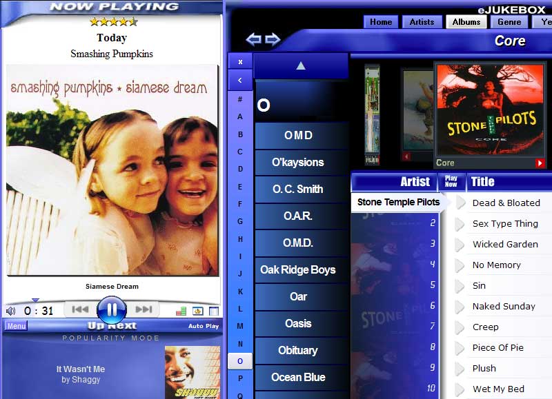
-New Large Play Control Buttons. Hold the large << >> buttons down to Reverse/Fast-forward and Click for Last Song/Next.
-New Display option to Enable/Disable large play controls.
-eJukebox now fully supports databases with more than 32768 songs
-small updates to the Default skin
-fixed the 'now playing' cover being incorrectly made small after left panel resized, maximized, left panel sizer bar clicked
-fixed the 'Up Next' song/cover display shifting to the left when the song title was short

Note to Dark Skin Users:
If you are using a dark skin and do not like the white << >> button backgrounds you can temporarily install dark buttons by extracting the
BMP files in the attached pcontrols.zip into C rogram
FilesimagesTheSkinName folder. Just make sure to watch for when that skin's download in the forums is updated with new buttons. Then you can download
and save the updated skin.zip over the old one in your skins folder and the author's new buttons will replace the old ones.
Note to Skin Developers:
The Large Play Control Buttons are skinnable and are made up of images for normal, hover, and down. They also each have a mask image where you can
specify transparency and change their shape.
To create large play controls for a skin: download the attached zip file and extract its contents into your '/images/skinname/' folder. You can
then make modifications to the .BMP files which make up the controls. View your modications by reloading your skin from the Tools button menu in
eJukebox. When you are done with your modifications please zip up your '/images/skinname/' folder and post your SkinName.zip to the forum so that
everyone can appreciate your new buttons!
Pirk - 7-21-2006 at 01:58 PM
Ah ah!  Excellent adaptation work Audiosoft!
The new "Reverse/Fast-forward and Click for Last Song/Next" features are really welcome.. 
I think that with these new play control buttons, the albums carousel, and the new Homeview.. you should flood the market rapidly: You are going to be
rich! 
Well.. now only the PLAYLIST still needs to be refreshed with the small album covers.. before you store up notes!! 
PS: I've already changed the colors of your large play controls for my own skin. 
Thanks a lot.
CiXel - 7-23-2006 at 06:10 AM
WOOOOO HOOOOOO
Large play buttons!!!!!!!!!!!!!!
Sorry, just a little excited 
CiXel - 7-23-2006 at 06:25 AM
Now that's I've upgraded to 4.0b1 I get this scrolling across my Album cover:
"Do to server upgrades this copy of eJukebox is no longer able to lookup Album Cover Images. Please upgrade to eJukebox v3.5 via the audiosoft.net
website to regain this functionality."
Huh? 3.5?
And I don't even have album cover lookup enabled 
Audiosoft - 7-23-2006 at 07:14 AM
CiXel,
The new version check server was not ready for a # 4.0 yet so you got that old scrolling message. I think I have fixed the problem on the server and
the message should disappear if you restart eJukebox. Let me know if it does not.
CiXel - 7-23-2006 at 03:15 PM
No Dice. Tried restarting EJ and then a restart to the computer.
Still scrolling....
rllercstr7 - 7-23-2006 at 03:56 PM
Looks good Audiosoft!
sjb700 - 7-28-2006 at 06:31 PM
marvelous.
I know the carosel is 'just' eye candy but it's awesome 
All my mates are envious and want thier own now!
Just so you know I'm running on WinXP x64 Pro and have had no problems, keep up the good work!
CiXel - 8-5-2006 at 03:18 PM
Is anyone else having an issue with the scrolling server message in 4.0b1?
Maybe the quick fix is just to revert the "call" to 3.x for the moment.
sjb700 - 8-6-2006 at 10:33 AM
I'm not having any trouble with that but I have found one bug:
When I edit song details, occasionally ejukebox will hang while it is saving the edit.
I've not been able to narrow it down to a specific circumstance I'm afraid, it happens if I make single or multiple edits, just change the genre,
just change the name, just change the album art... whatever
It happens probably every 3 or 4 edits I make on average.
To get out of it I have to use task manager to kill ejukebox, then when I start it back up I can make the same edit that caused the hang and it will
work fine.
rllercstr7 - 8-6-2006 at 04:35 PM
I have also noticed some stability issues with eJukebox lately. It seems that when I have multiple programs open and then try and open another
instance of IE, eJukebox stops responding.
rlailey - 8-15-2006 at 10:04 PM
Everybody is going to hate me for saying this, but whilst the large play buttons are a long required necessity in this latest version, the revolving
album list is not real to life.
If these albums were to be viewed bang-on (which they're not as they are at the top of the screen) then the left and right edges of the carosel would
be tapered in more height wize and as the albums begin to go around the corner and start facing the other way. They would become more grey (less
colour) as they turn around the corner. They also appear to be jerky, and I thought I had a good graphics card and system.
But hey, I'm just a perfectionist and hopefully what I say will become lost amongst all the other posts as this is a great transformation from eJ 3.x

 rogram
FilesimagesTheSkinName folder. Just make sure to watch for when that skin's download in the forums is updated with new buttons. Then you can download
and save the updated skin.zip over the old one in your skins folder and the author's new buttons will replace the old ones.
 Excellent adaptation work Audiosoft!


